
Hitting the longest home run
In my safe and narrow social media life, there are frequent references to baseball and Mickey Mantle. A story that shows up regularly is about Mickey Mantle’s 734-foot home run and several other home runs longer than 600 feet. As this column is in Michigan Today, I note that Mickey Mantle was especially good at hitting long home runs when playing the Detroit Tigers.
Of course, there is controversy about these home runs and whether or not they are accurate measures. So scientists get involved, and they consider all sorts of extenuating circumstances. They develop models and make arguments and come to solutions. Then scientists and statisticians get together to rank things; they have discussions and develop methods of, perhaps, consensus ranking.

Mickey Mantle was especially good at hitting long home runs when playing the Detroit Tigers, the author notes. (Image: Wikipedia.)
By the time the scientists are through, some maintain that Babe Ruth hit the longest home run at 575 feet, and Mantle’s 734-foot home run is marked at 565. And seemingly, we have to ignore minor leaguer Joey Meyer’s 582-foot home run.
Suppose we were to think of the circumstances that lead to an extraordinarily long home run. In that case, we realize a lot of things come together to make it happen: the precise nature of the bat, the specific ball, the speed and spin of the pitch, and the fast-twitch muscles of the particular swing. There are issues of weather: temperature, humidity, and the turbulent eddies in the atmosphere. There are questions of measurement of velocity, distance, and where exactly did the ball land — or where would it have landed if it had not hit the top deck of the stadium?
Now, let’s consider Major League Baseball since the days of Mickey Mantle. With the longer season, lengthy post season, and effects of baseball’s steroid era, we have seen many more opportunities for players to hit home runs. According to theanalyst.com, 2019 saw the greatest number of home runs, and 10 percent more than the second-place year, 2017.
Simple math shows we count many more home runs today than in 1921 or 1963. But there do not seem to be many home runs competing with Babe Ruth and Mickey Mantle in terms of the longest home run.
With all of the powerful hitters of the last 20 years, why do the records set by Mickey Mantle (or Babe Ruth) still stand?
Mapping it out
Elsewhere in my safe and narrow social media world, I encountered this map of “Year and Decade of Highest U.S. State Temperature Records.”
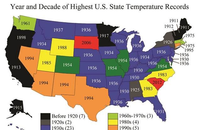
People were passing it around: “Thought this was interesting…”
I agree. It is interesting.
Though posted without further discussion, this figure is used in a web posting titled, “Historical data destroys the global warming myth, and people are waking to it.” Therefore, I assume that its appearance in my social media stream is meant to provide evidence that Earth is not warming.
The figure offers an appeal to reason: If Earth is getting warmer, shouldn’t most of these records be in, say, the last two or three decades? It is a simple (and interesting) appeal.
It is, however, too simple. The metric of temperature in the map is neither representative of Earth’s climate nor does it have a sturdy foundation in the science of climate change.
Aside from Mickey Mantle being fun to write about, I argue that using U.S. states’ record-high temperatures as a primary measure of global warming is analogous to saying that because no one has hit a home run farther than Mantle or Ruth, there is no reason to believe that the collective of baseball players is not hitting more home runs.
Hot fun in the summertime

By the time the scientists are through, some maintain that Babe Ruth hit the longest home run at 575 feet, says the author. (Image: Wikipedia.)
There are some interesting similarities between baseball and climate in this case. And, no, I am not going to say that a warmer climate leads to more, but shorter, home runs. (That is a hurricane – climate change joke.)
First, the temperature records presented in the map, I believe, come from this table at the National Centers for Environmental Information.
In much the same way that scientists and statisticians have argued over long home runs, the figures recorded in this table are determined by a committee of experts. Since such records are so rare, the committee is looking at the extenuating circumstances to determine if the measurement is, in fact, accurate and representative. They develop a consensus, or at least a majority decision, before listing a record in the table.
Like Mantle’s longest home run, the temperature records here require multiple conditions to come together for this one measurement to be deemed extraordinary. These are likely to be very localized effects related to temperature, humidity, and the turbulent eddies in the atmosphere. It’s essential to recognize idiosyncrasies in the observing system and its siting.
By definition, such measurements are not representative of the climate; they are representative of conditions that come together to yield an extreme value.
Bring the heat
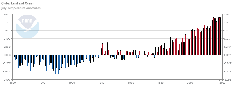
If we want to look at how Earth is warming, we need to consider measurements that are representative of Earth and its climate. Several organizations, including the National Centers for Environmental Information, present such measurements monthly. The figure here shows Earth’s warming and the upward temperature trend.
If we want to look at a map similar to the record-high state temperatures figure, then the following map, below, is more appropriate.
Rather than daily highs, this shows the daily temperature average, an average of highs and lows. Since nighttime lows are more strongly affected by greenhouse gas warming than daytime highs, this average more honestly reflects what we know and expect from scientific investigation.
Rather than highest-ever recorded at a point, the figure below shows the state average. This better represents the definition of climate as average weather conditions in a defensible way.
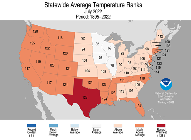
This map represents the rank of July 2022 in a record of 128 years. If, as in Texas, the number is 128, then it was the hottest ever. If, as in New Mexico, it is 124, then four years have been warmer and 123 have been colder.
The number 98 would be 30 years ago, and we see that only 10 states in the continental U.S. reach back more than 30 years to find a hotter July. This, too, is interesting, but this article is already too long.
So, when looked at in isolation, the original figure of state records represents cherry-picking, a logical flaw. It does not destroy the global warming myth. Over time, however, we would expect to see these records start to fall. They are, perhaps, a lagging indicator of the state of the climate.
Likewise, if we could account for the differences between bats and balls and the ways we measure, we would expect Mickey Mantle’s record to fall with so many more home runs being hit. Someday, somewhere, everything will come together to hit that long home run.

Peter Lucyshyn - BSEE 1956; JD 1959
You’ve cherry picked a few decades for your narrative. How about expanding the time horizon by centuries – millions of years – six ice ages? Maybe we’re experiencing a natural weather cycle leading to (fighting) another one of these cycles. Not enough consideration of alternative facts or possibilities that don’t support the current green theme. Why hasn’t nuclear received the support that wind and solar have? Why isn’t adaption to weather changes been an equal part of the narrative – including using fossil fuels in cleaner ways while innovation in green technology occurs?
Reply
Abigail Welborn - BS 2004
For understanding why global climate change matters now, I really appreciated the book THE LONG THAW (https://www.goodreads.com/book/show/5430624-the-long-thaw). It explains in detail, but understandably, how we determine temperatures from the past, what is different now, and why it matters. The short version is that the planet will be fine and it’s our cultures that are getting disrupted.
As for nuclear, that’s a good question. It’s one of our best options for reducing carbon as fast as possible. While we might ultimately want something better, it’s better than coal and we can do it right now.
Reply
Abigail Welborn - BS 2004
Also that map of record high temperatures is outdated; WA state set all kinds of heat records in 2021!
Reply
William White - 2006
Speaking of cherry-picking data, I cannot help but notice that you have neglected to include error bars on your first graph of global land and ocean temperature anomalies. The graph you have presented purports to show a steady warmimg trend from 1880 to the present. Are you asserting rhat we know the global mean temperatures to an accuracy significantly better than 1 deg Celsius? Even going back to 1880?
I consider that an extraordinary claim, and would suggest extraordinary proof should be provided in support.
This seems to be the main flaw in climate-alarmism, that an exceptional (and unreasonable) amount of certainty is required to accept the claims made by this group.
Reply